Symend
Situation
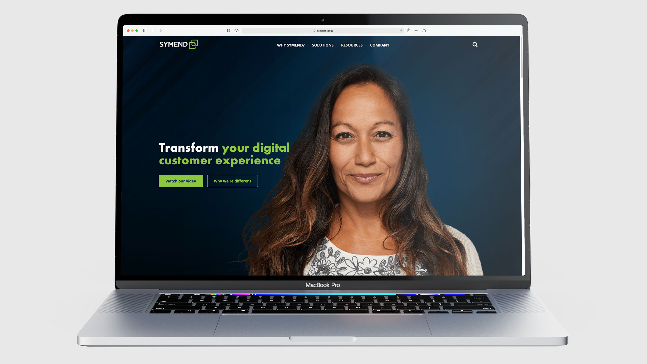
Symend is a Canadian fintech company that uses behavioral science and data-driven insights to help customers resolve past due bills. They wanted a refresh of their existing brand identity as the current one felt dated and generic. In addition, it was harder to implement across various touchpoints because the logotype was integrated into the overlapping squares symbol.
Solution
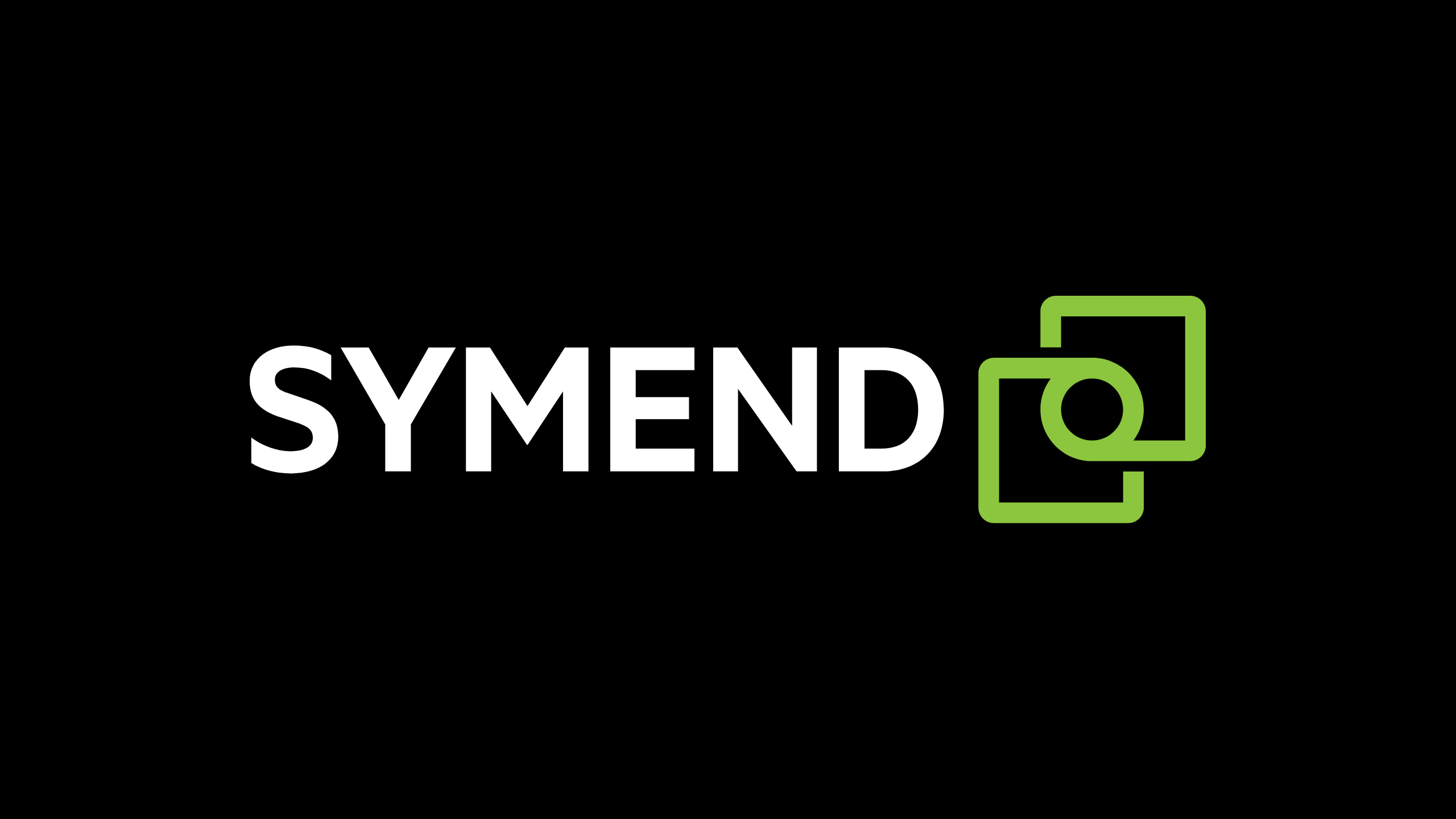
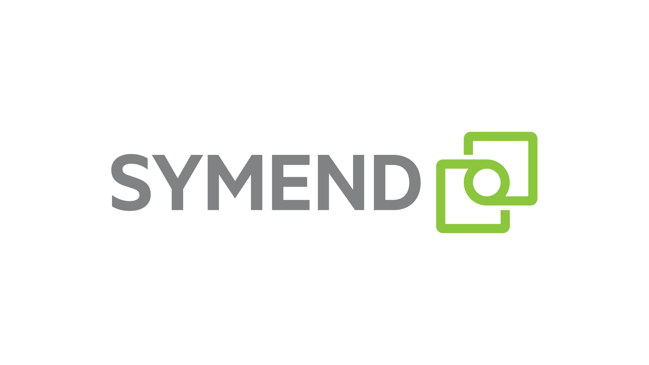
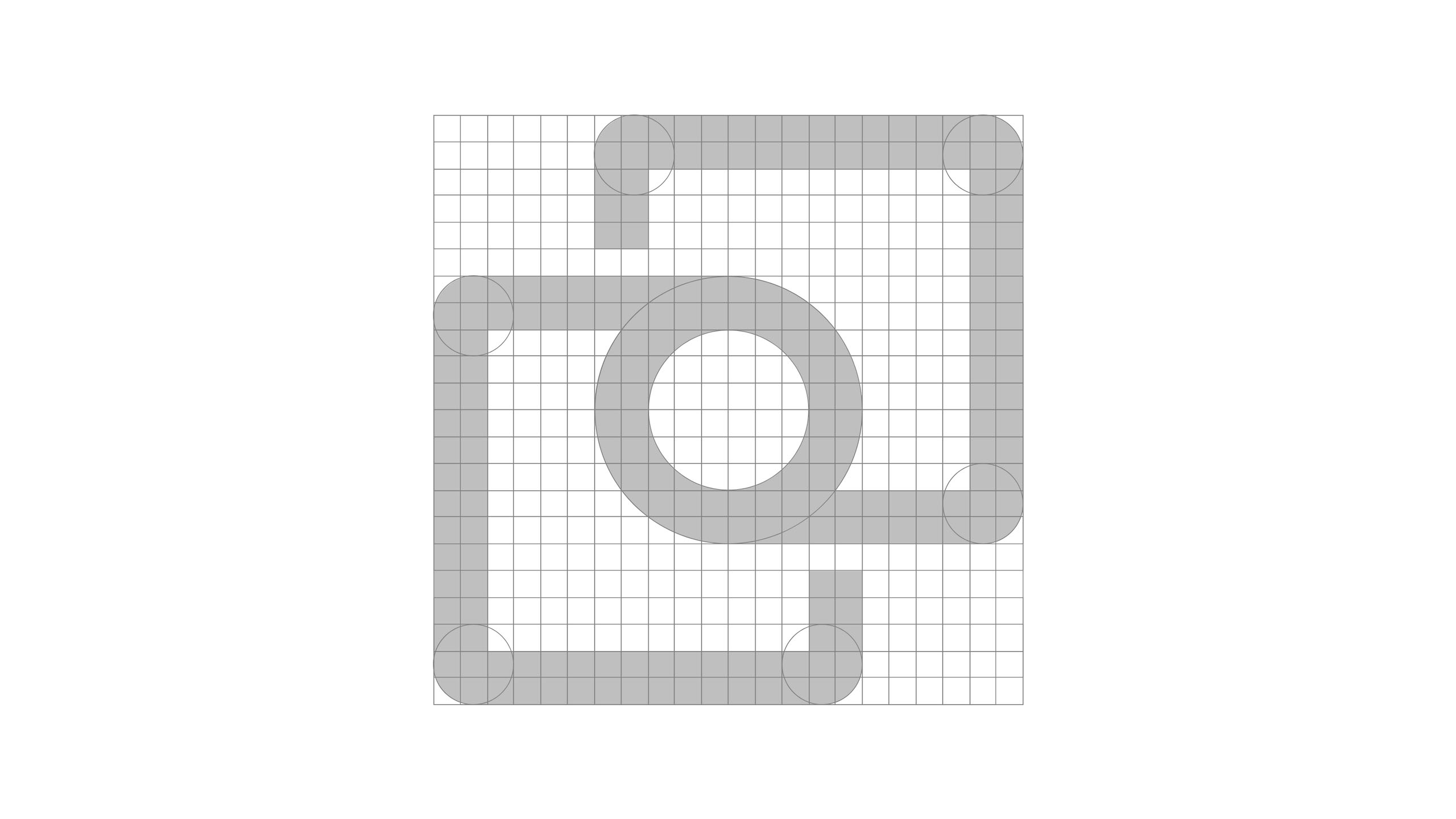
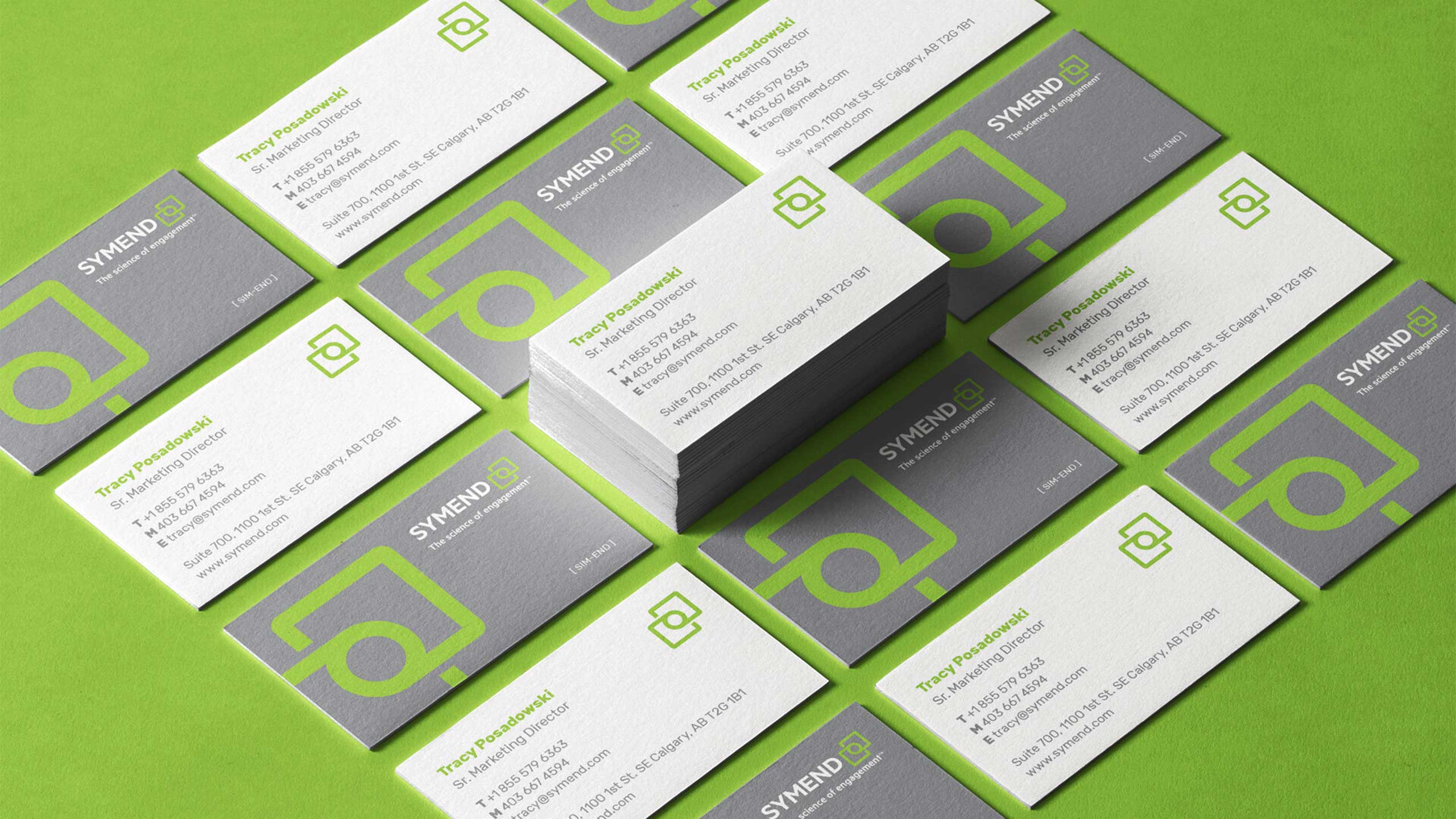
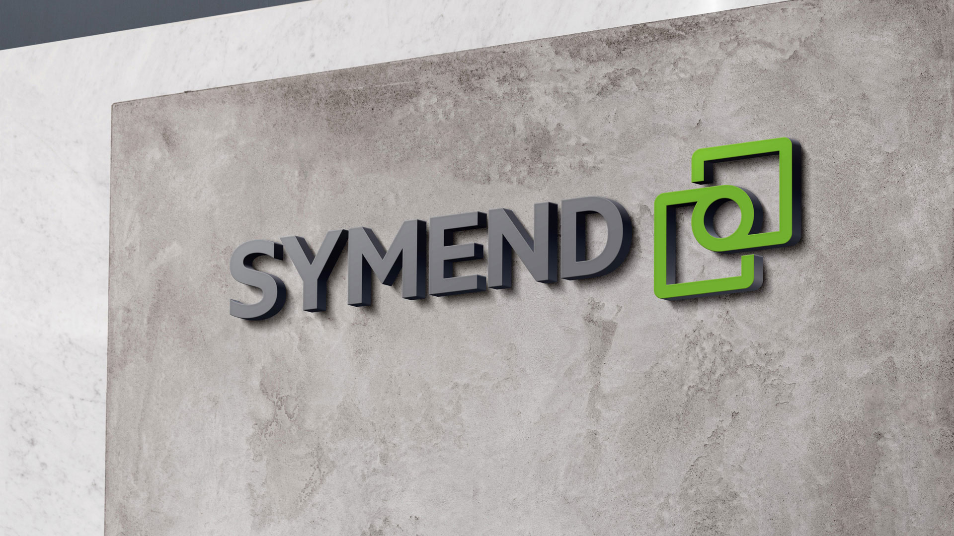
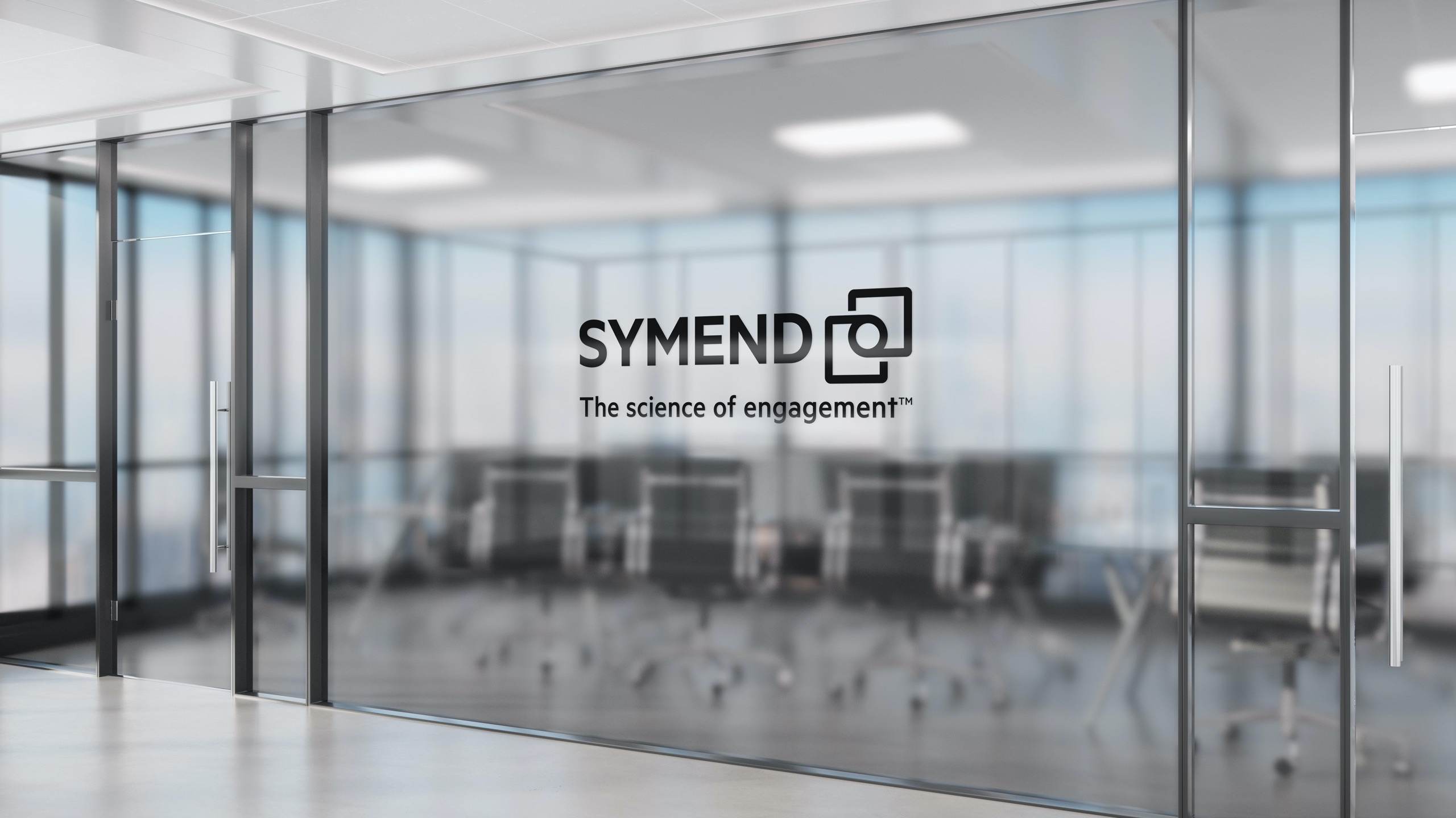
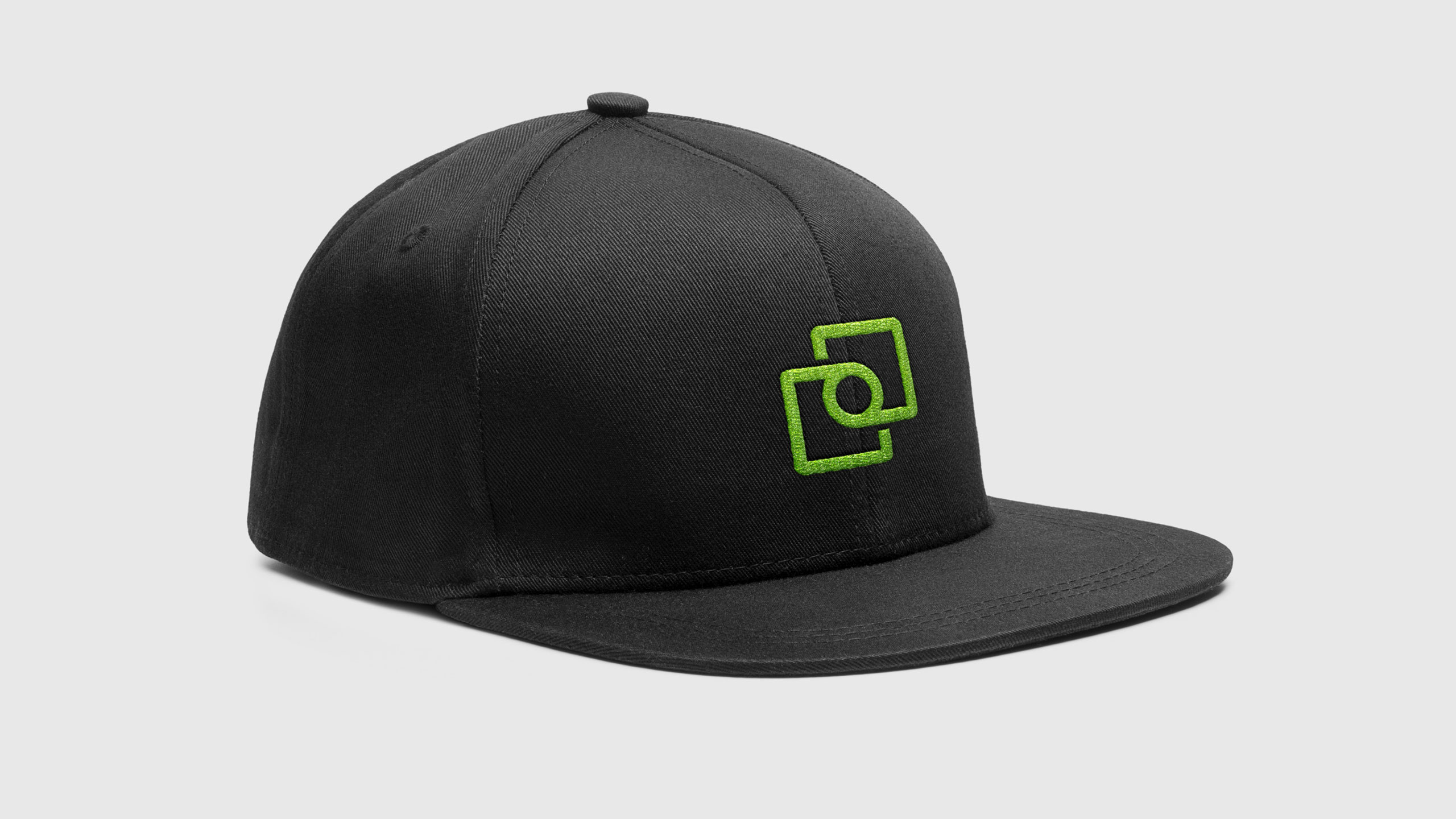
The new brand identity retains the older logo’s overlapping square motif, but separates it from the logotype as a stronger, stand-alone symbol. The added circle in the middle creates more visual uniqueness as well as creating a “resolve” of two parties coming together. A new bright green brand color was chosen not only for being not too far off from the previous teal color, but also to stand out from the crowd. Many of their competitors use blue as their main brand color.
Details
Role — Lead Designer
Studio — Athorn Clark & Partners
Discipline — Brand Identity

Other Work
SwimBrand Identity, Web Design
UnicelPrint Design
InvestcorpPrint Design

MendBrand Identity, Web Design
NationwideBrand Identity

Heinrich TypefaceType Design
Notable ExtrasVarious Disciplines
©2025 Andrew Henry