Swim
Situation
Swim is an American software company that helps organizations transform their business operations by continuously augmenting human decision-making, using the most accurate, relevant data possible from real-time and contextual data sources. Their main issue was the that brand identity was unclear both in what it was, and what it was trying to convey. The fish is in fact a sailfish, not a swordfish as most people assumed. And the sailfish was chosen because it's the fastest swimming animal in the ocean. They considered the element of speed to be one of their key selling points.
Solution
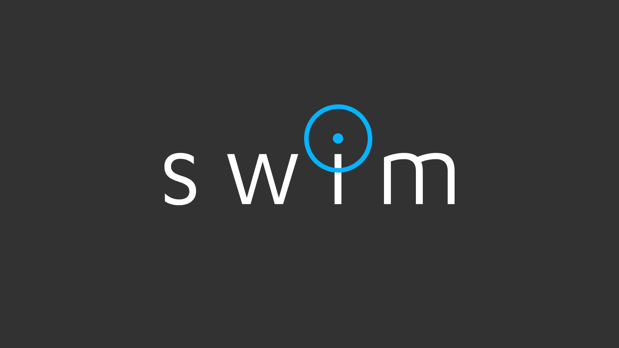
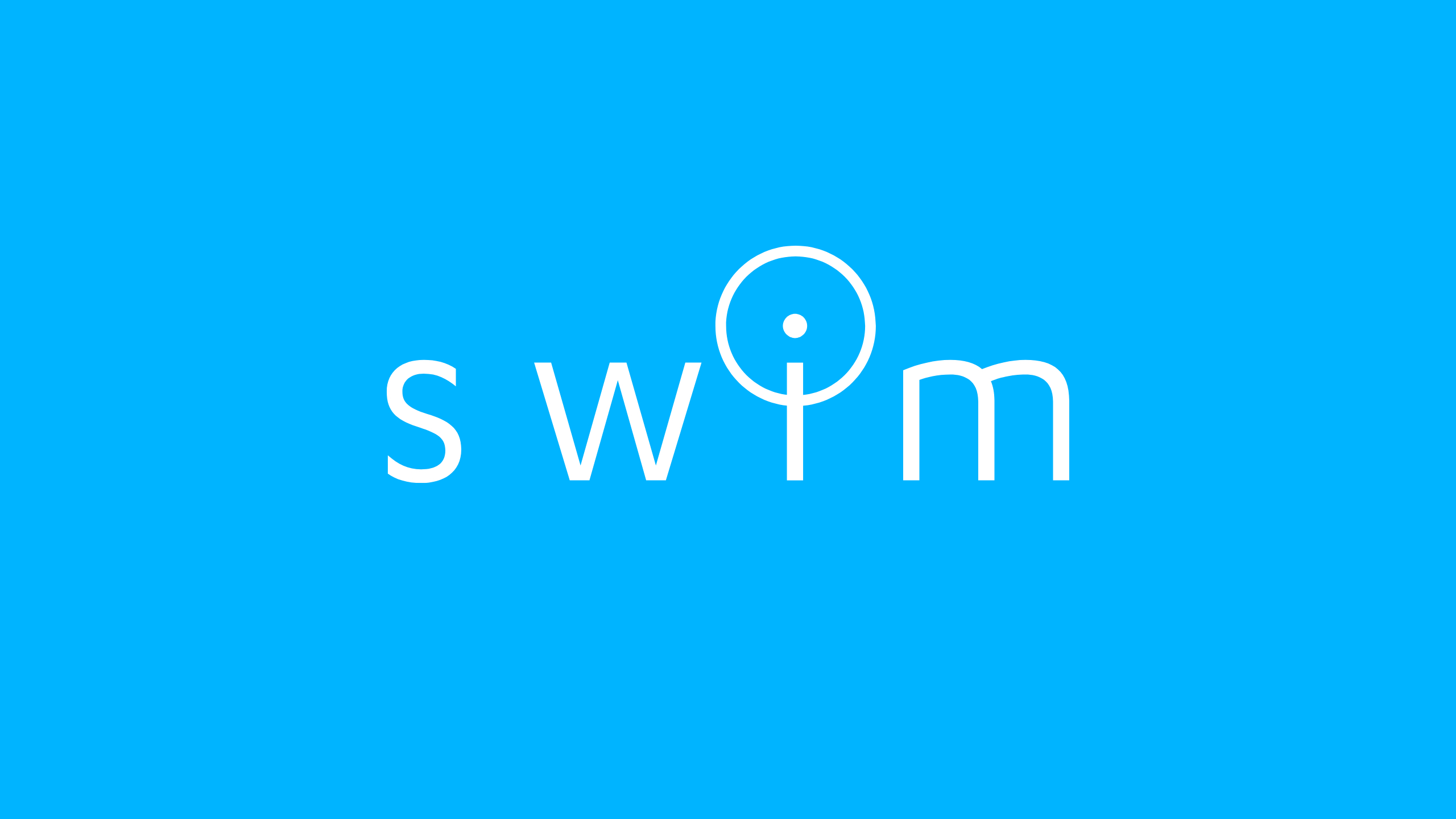
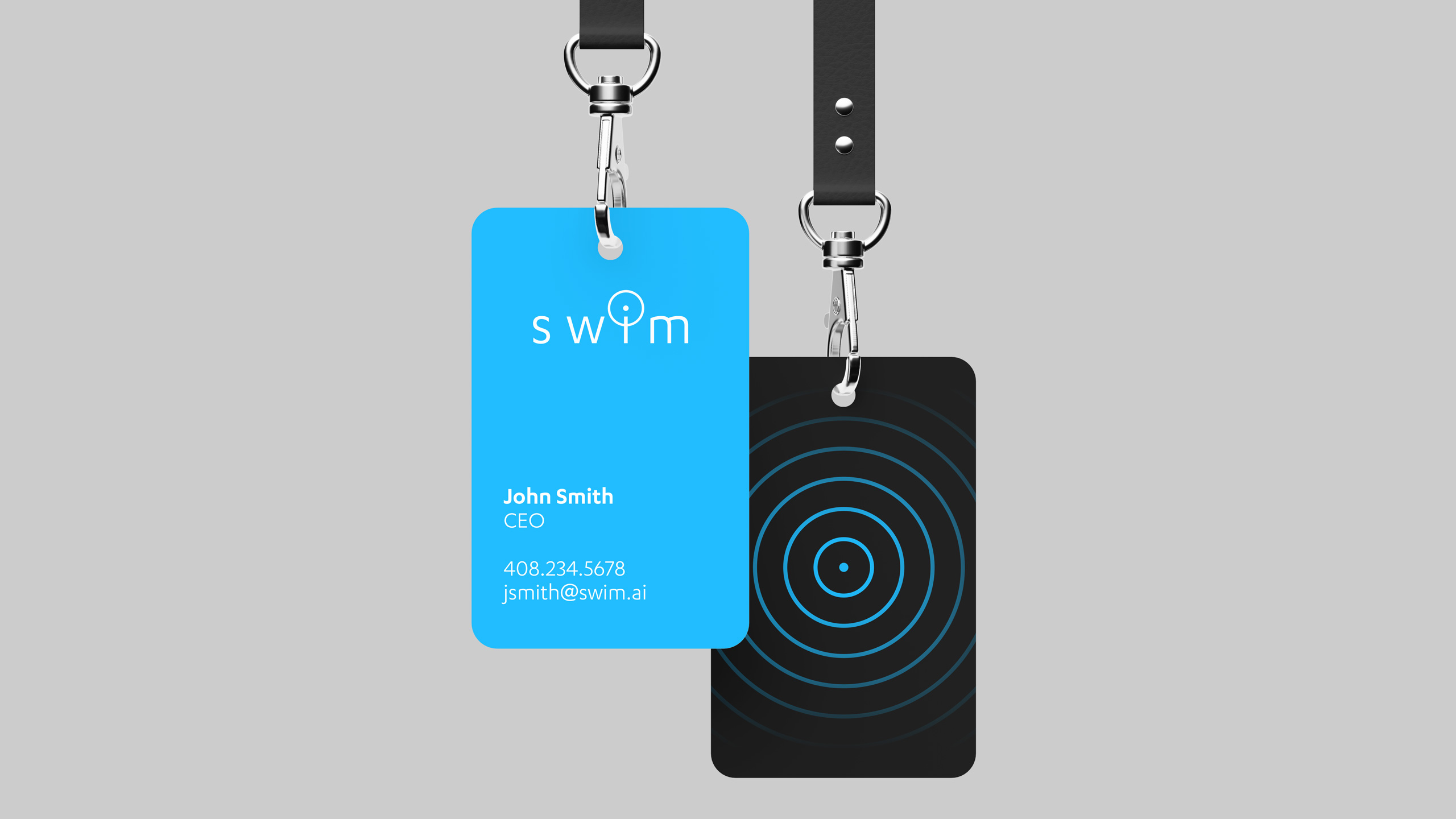
Instead of trying to educate people on sailfish, or rely on their marine animal knowledge, I thought it made more sense to focus on the "data" aspect of their business. Although it seemed like a tricky task to visualize something invisible to human eyes, I saw an opportunity to portray this data based on the user interfaces in the company's software. The "ping" symbol spoke to me as something that represented the "immediate" and "live" nature that they wanted to convey about their business. This proved to intergrate nicely into their logotype with the "i" becoming the dot of the ping. Playing off the ping/dot idea, this carried over into other brand visuals like dot patterns and fluid grid meshes.
Details
Role — Lead Designer
Studio — Athorn Clark & Partners
Discipline — Brand Identity, Web Design
Old Logo
Competitor Logos
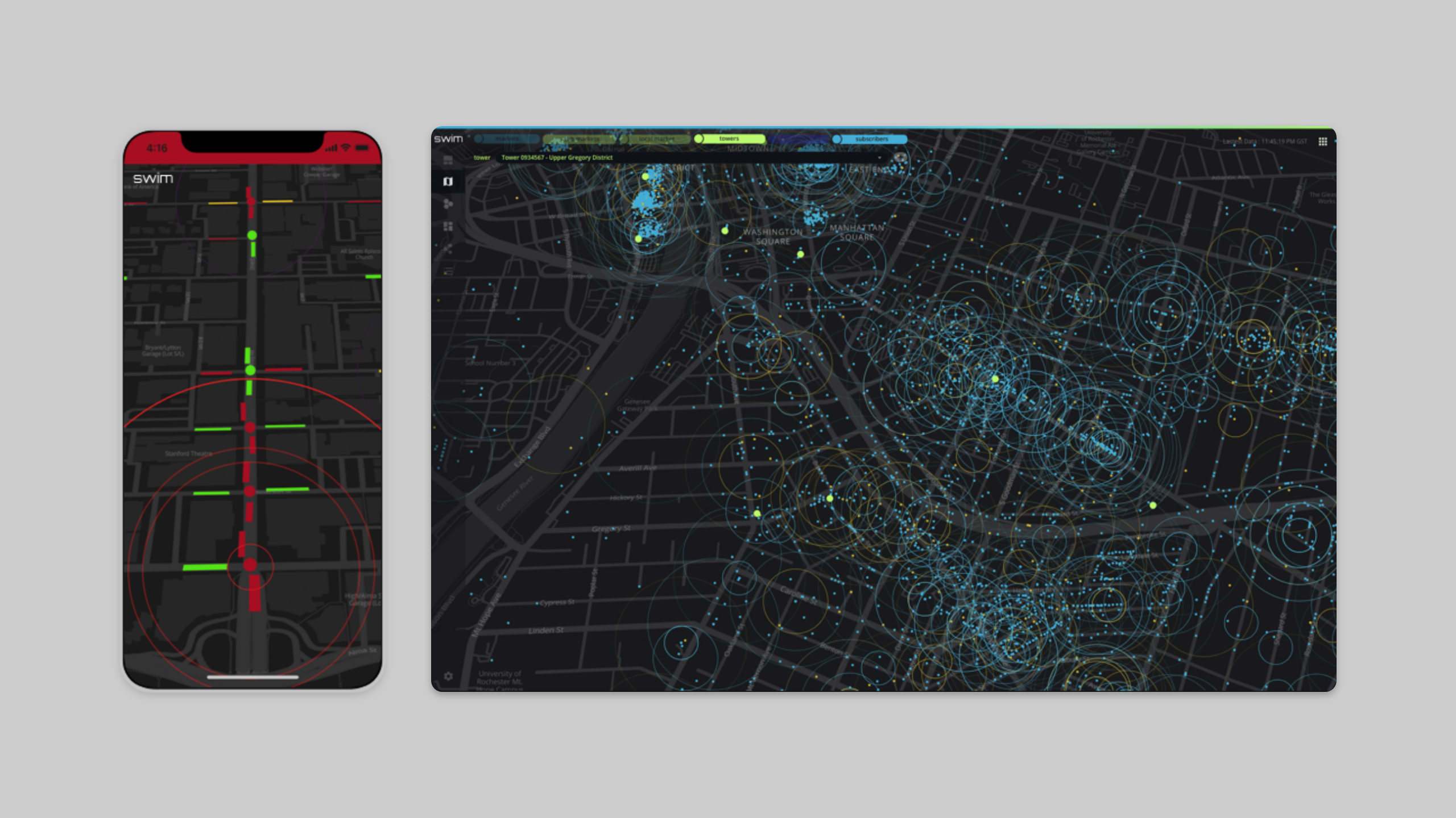
Product Interface Example
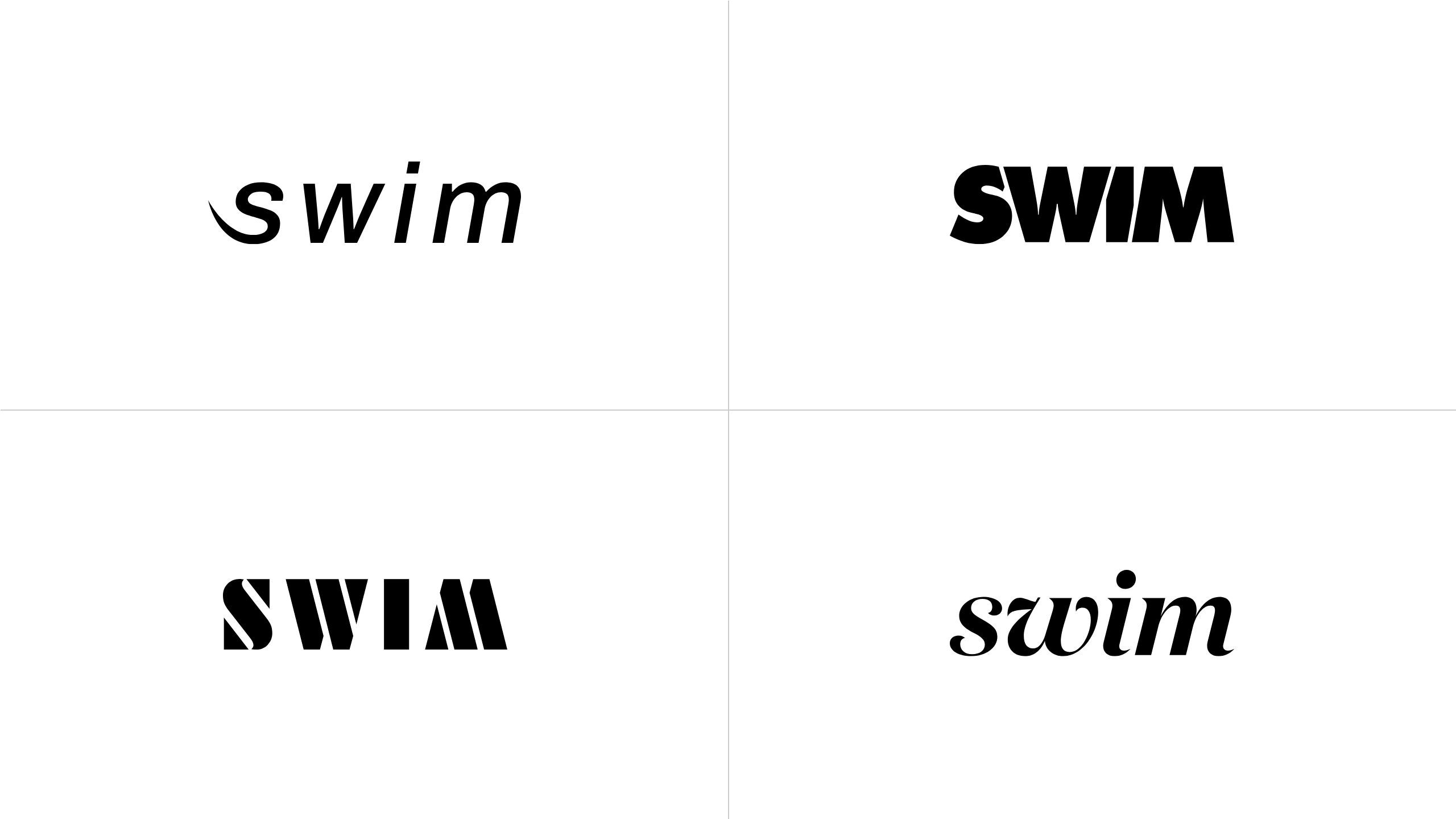
Early Logo Ideas


Other Work

UnicelPrint Design
InvestcorpPrint Design
SymendBrand Identity

MendBrand Identity, Web Design

NationwideBrand Identity

Heinrich TypefaceType Design

Notable ExtrasVarious Disciplines
©2025 Andrew Henry