Mend
Overview
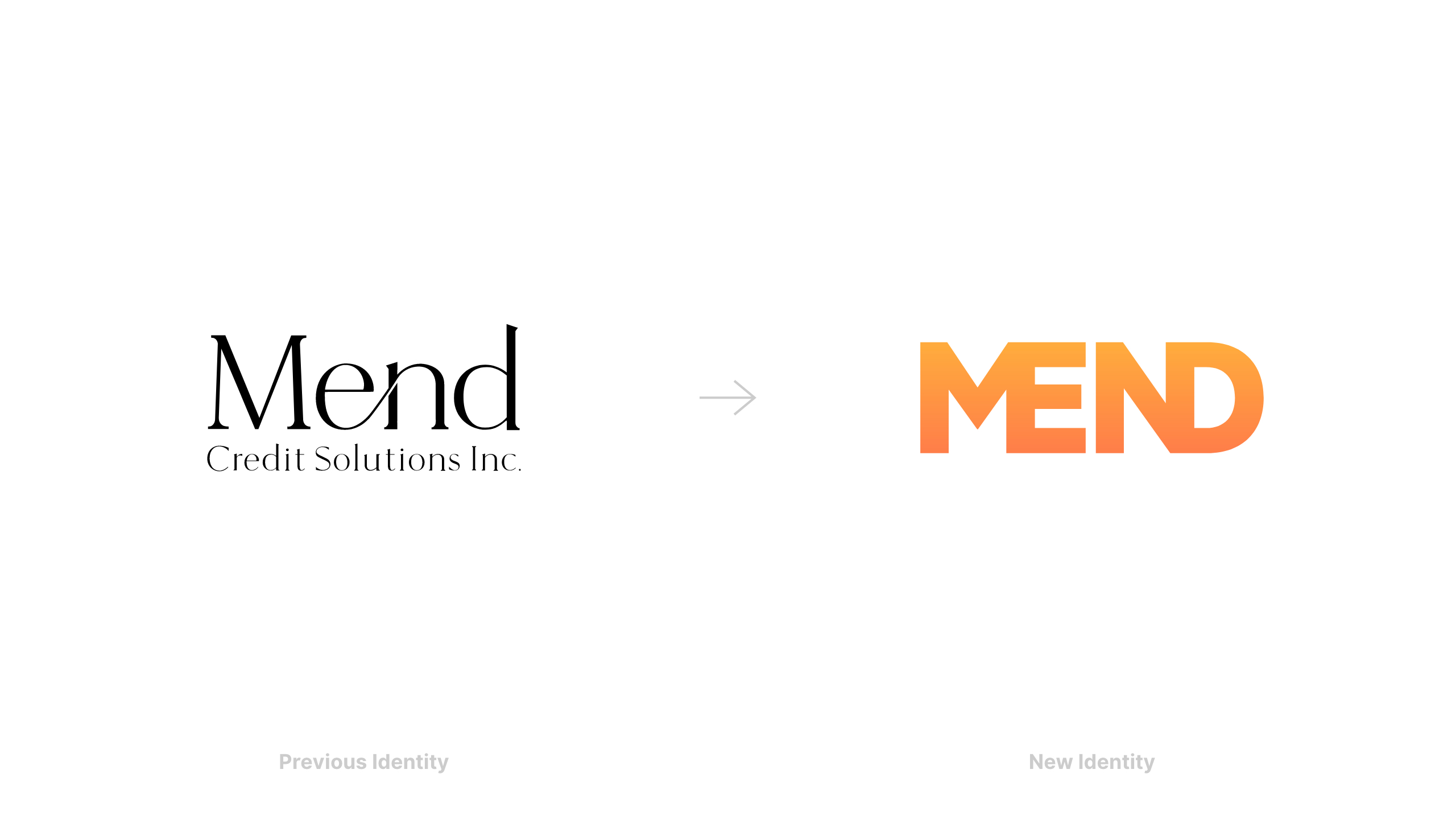
Mend is a digital collection agency operating in Canada. A brand identity was created to position the company as the friendlier alternative to traditional debit collection agencies. The logo design is inspired by the name itself, by "mending" the letters together. A warm color palette conveys the sense of compassion and empathy of the brand. The brand color, a gradient orange, is noticeably different from the typical cool color palettes of the financial sector. In addition, a simple single-page website was designed to help onboard new customers.
Details
Role — Lead Designer
Studio — Athorn Clark & Partners
Discipline — Brand Identity, Web Design


Other Work

SwimBrand Identity, Web Design

UnicelPrint Design

InvestcorpPrint Design

SymendBrand Identity

NationwideBrand Identity

Heinrich TypefaceType Design

Notable ExtrasVarious Disciplines
©2025 Andrew Henry
