Nationwide
Overview
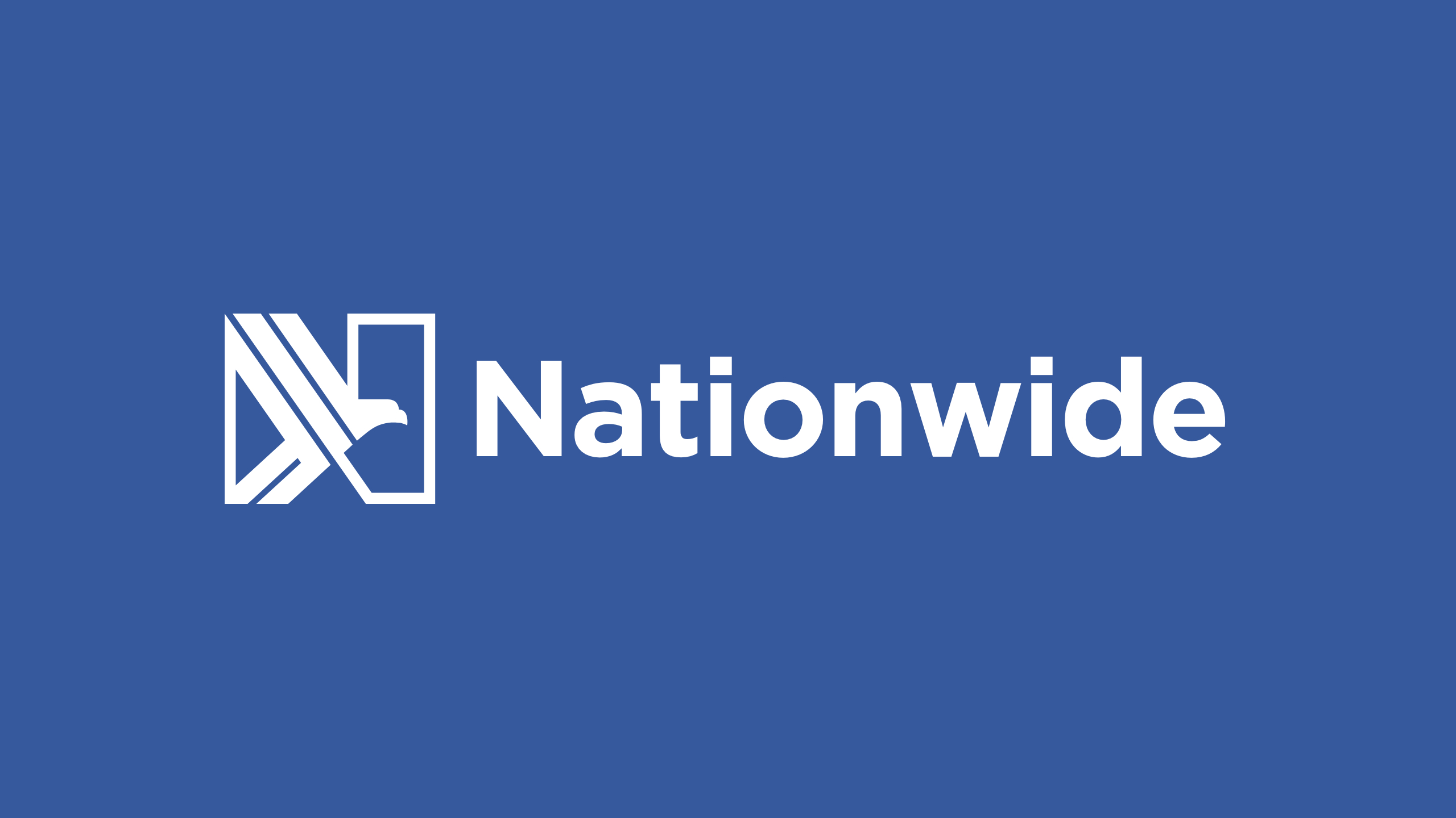
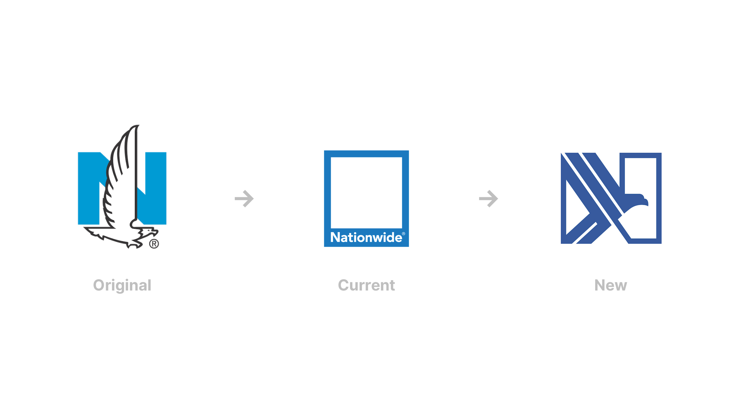
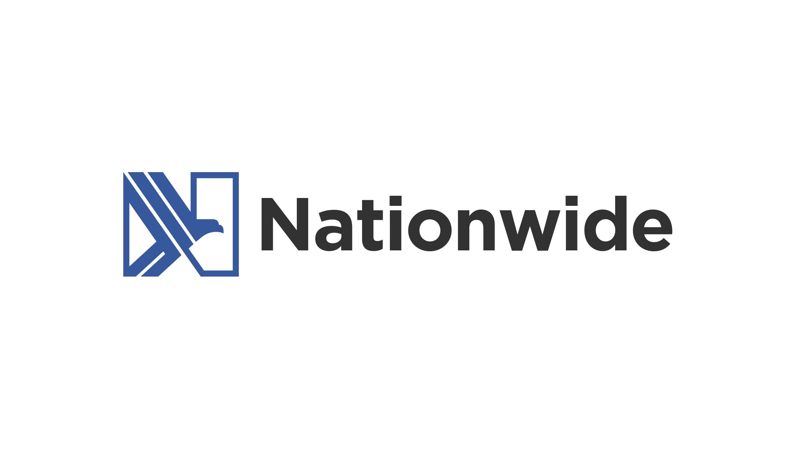
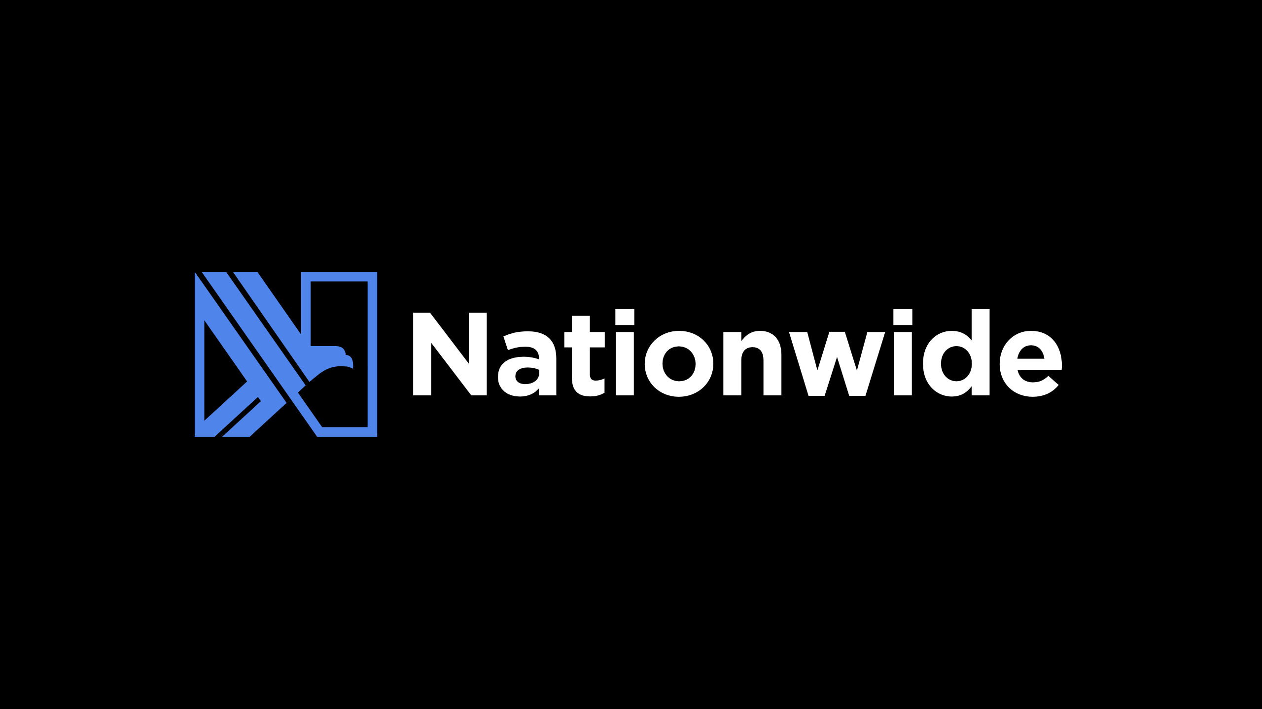
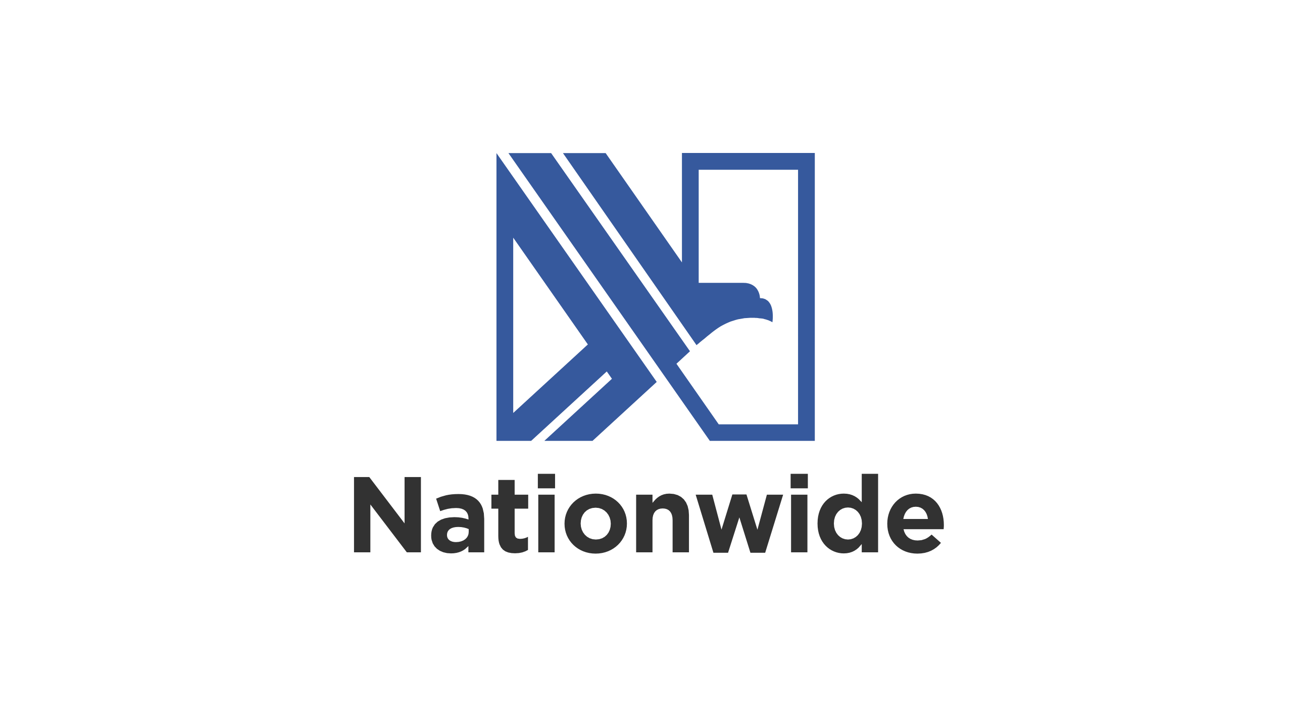
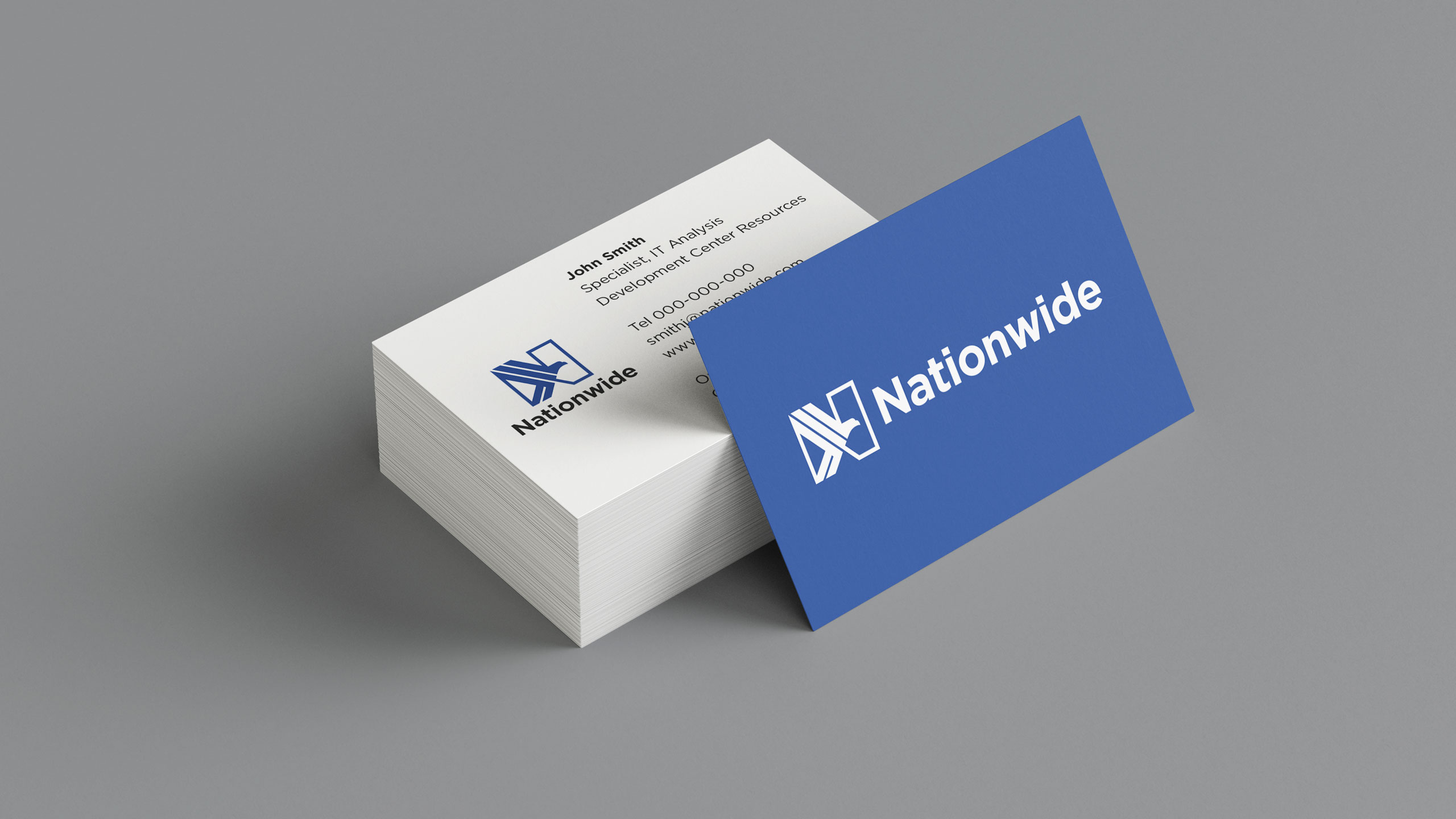
Nationwide is one of largest insurance providers in the US. At the time, their logo was a blue box known as “the frame”. Nationwide had discovered through market research that their original logo from 1955 had better public recognition than its current one. The brief was to design a new logo that differed from the original logo, but still contained the original elements, the letter N, and an eagle. Instead of placing an eagle on top of the N like the older logo, my solution was to integrate the eagle into the letterform. This strengthened the N as a letter, and simplfied the logo as a whole. This is a concept that made it to the final round of reviews, but it was not ultimately chosen.
Details
Role — Lead Designer
Studio — Chermayeff & Geismar & Haviv
Discipline — Brand Identity


Other Work
SwimBrand Identity, Web Design

UnicelPrint Design
InvestcorpPrint Design
SymendBrand Identity

MendBrand Identity, Web Design

Heinrich TypefaceType Design
Notable ExtrasVarious Disciplines
©2025 Andrew Henry